Chart Configuration
The Chart Configuration panel is a docking panel found to the right of the Retirement Solution page. The options are discussed below.
Chart Options
View 3-D
Check this box for the chart to be displayed three dimensionally.
View Each Bar a Different Color
Check this box to display each bar in the chart a unique color.
Comparisons to Print
Select which Retirement Solutions options to include when the Solutions, All Charts report is selected.
Defined Benefit Plan Options Chart
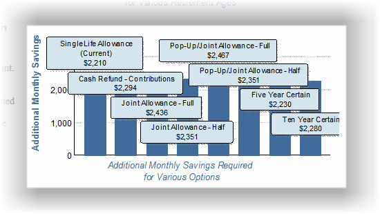
The DB plan option chart may display a large number of options. For example, for the state of New York, many of the plans will illustrate eight options. When printing the Savings Solutions, All Charts report, the chart may appear cluttered because it's smaller size and for having so many options. Here is an example of what may appear:

For many, this chart is meaningless. To avoid charts like this, the DB option charts that have more options than the "Max Options" value (unless the "Max Options" value is zero, in which case it will always be printed).
| Note: | This chart can still be printed using the Retirement Solutions-One Chart report (which only prints the current chart. It must be included in the report list, which is configured in the File/Config/Gap Analysis/Calculator configuration page). |
