Chart
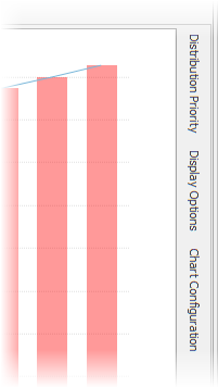
A sample retirement years chart is displayed below.

Clicking on any bar will display the values for the specific year. For example, clicking on the bar for 2041 above would result in the following display.

To return to the multi-year chart, click on the "Multi-Year" button at the top-left of the pie-chart.

When viewing a single year, several options are available.

Show Market Hit
To illustrate a downturn in the market at a specific point in time for a client and/or spouse's retirement picture, click "Show Market Hit" and selected the downturn percentage (10-50%).
This will enable a bear market icon over the first year of retirement that can be moved by clicking on the icon and dragging it left or right to illustrate the market hit at different years in retirement. In the scenario below, a 15% market hit occurs 10 years into retirement and will effect the shortfall accordingly.
![]()
A new header will be placed above to allow for toggling on/off for various calculation page reports for easy illustrations.

| Note: | The reports will reflect the market hit if selected. |

Calendar Year
Below the pie chart a track-bar is available for sliding between the calendar years in retirement.
Account Distribution Priority
The priority of distribution from non-annuitized cash accounts is shown to the right of the chart (above). Drag-and-drop accounts in the desired order of distribution.
| Note: | The Apply Order Changes... option is only available in the Gap Analysis calculator and allows changes in priority during retirement. Otherwise the priority affects distributions starting at retirement. |
Configuration Options
Configuration options for the chart can be found in the Display Options and Chart Configuration docking panels tabs located the right of the chart.

