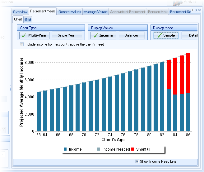
The Retirement Years screen displays the various forms of retirement income during the retirement years in both a chart and in a grid.
Display Options
The Display Options tab at the right of the screen can configure a number of display options.
Display Values
Select what is to be displayed in the chart by clicking on Incomes, Balances or Both (the later displaying two charts).
Display Mode
Select the Display Mode for the income chart
several items can be configured for displayin ght
There are several options for displaying the chart:
Multi-Year vs. Single Year buttons
The chart can display either all years during retirement in a stacked bar format (shown above) or a single year in a pie chart (shown below).
To the right of the chart the distribution order of the accounts is displayed. The order may be changed by dragging the accounts to a new position in the list.
In the Quick Gap calculator this changes the distribution order for all retirement years.
In the Gap Analysis calculator, the change is applied to either the first year in retirement (similar to the Quick Gap option), or from the selected year forward. This is determined by the selection of "Apply Order Change to..." above the account list. This order of distribution continues until a new distribution order is encountered (if any). An orange bar will appear in the chart to indicate which years have changes in distribution order.
When viewing a single year, a slider-bar appears at the bottom for scrolling through the various years.
| Hint: | To view a specific year in the chart, simply click on the specific bar in the multi-year view. |
Configuration Options
The following options may be configured using the buttons above the chart.
Income Sources vs. Account Balances
The chart can display either the income sources during retirement (shown above) or the account balances during retirement.
Note: In the multi-year chart, click on a bar to view data for a particular year.
Simple vs. Detail
This allows for seeing income or balances by account or viewing a total of all accounts incomes verses shortfall. For example, the same chart shown above (shown in detail) is shown in simple mode below.

The following option to configure the grid is available below the chart.
Show Income Need Line
This check box toggles the income need line (shown in the stacked bar chart above).
Group Additional Incomes
When working with more than a handful of additional income accounts (from the Other Accounts tab), the chart may become confusing. Check this box to reduce the clutter.
Pop up Menu
Right clicking over the chart allows for these options:
View 3-D
Toggles if the chart is viewed in 3-D or 2-D.
View Legend
Determines the location of the chart's legend.
Income Values
The chart allows for both Annual Values and Average Monthly Values.
| Note: | When working with Annual Values for clients who have a fractional year in retirement life expectancy, the final year will appear shorter than prior years because it is not a full year. |
Horizontal Axis
Along the horizontal axis (years) there are 3 options to display data:
1.The client's and spouse's ages
2.The date
3.Year (calendar year)
4.The year number (from the first retirement)
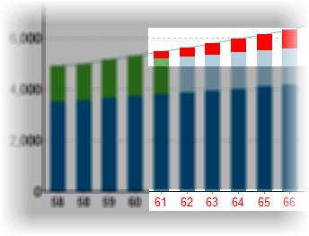
Show Years with Shortfall in Red
If this is checked, labels associated with retirement years in the chart with an illustrated shortfall will be colored red (otherwise all labels are displayed in the default color).

Grid
The Apply Best Fit button below the grid resizes the columns to fit best in the grid.
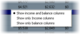
By right clicking over the grid, a pop-up menu will be displayed to select which columns are visible in the grid. The options are displayed in the image below.

