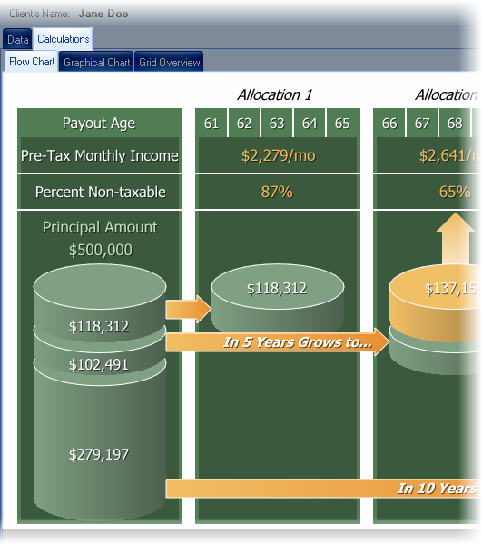
Flow Chart

The Flow Chart provides an clear and attractive method for helping a client understand how their money is being handled. The far left column shows how the lump sum is divided between the various allocations. Moving right, each column displays the information for an allocation, including (starting from the top moving down):
1.The pre-tax monthly income.
2.The percent of the income that is not taxable (for illustrations using non-qualified money only), and
3.How much the account will grow to (only if the allocation includes a deferred annuity).
